The design process doesn’t rely on any specific design method. It’s based on the experience of designers working on the project. Here is what we’ll do: listening to stakeholders and users, taking notes, clearly understanding the context (project, users) and the tasks to be handled by the app, using interaction and information display best practices, reviewing and comparing exhaustive design systems, and running qualitative tests with users.
Method
Aspirations
OSRD should reflect its prospective and industrial nature. It belongs in a library, an engineering office or a workshop, rather than in a shopping mall or a candy store. Aesthetics and behaviour will be used to convey this.
The flat design trend allows for very elegant and minimal interfaces. But it also makes it harder for interactive elements to appear so. In this project, we’ll be adding a little more depth and presence when visually rendering buttons, input fields and such, so they can better be distinguished from content at a glance.


Constraints
Accessibility
OSRD will be a complex tool by nature, with a large amount of informations to display at once to make it effective to those who will work with it. Sufficient contrast in colours and comfortable active zones for interactive elements will have to be used as much as possible, while ensuring rich semantics are visually expressed and that sufficient efficiency is reached by users on the target screen size.
Discoverability
OSRD is an industrial tool, not a public facing website where users have to figure out every task at hand on their own. The axiom “UX is like a joke; if you need to explain it, it isn’t that good” doesn’t apply in such context. Still, we must do everything we can to figure out smart and obvious ways for users to accomplish their tasks.
Longevity
Complex interfaces take a fair amount of time to be designed, and a redesign is costly. OSRD should remain usable and pleasant to use in 2033 and beyond. We’ll rely on as much timeless aesthetics as possible, and steer away from any 2023 cool graphic gimmicks.
Independence
As an Open Source project financed by the European Union, OSRD doesn’t have pre-existing brand guidelines to work from when orienting its visual langage. It should not be associated with any particular European rail operation company graphic identity, and remain on a neutral ground. Starting out without any guidelines can be paralysing, but it gives us wiggle room to design a tool we’re going to love to work on.
Sources
Design Systems
Reading and comparing a few prominent, exhaustive, and public design system documentations was a great exercice to understand how other teams operating large software project decided to define colour, typography and interactions.
Rhythm
Vertical
Just as with ruled paper, having text and elements evenly placed and dimensioned vertically provide visual harmony and eases eye parsing, reducing tiredness over time.
The 8px increment is widely used, as it can provide meaningful line heights for text, distinctive icon sizes, and comfortable interactive elements dimensions. It’s also very much rooted in computation, which makes it even more pleasant to settle on and set rhythm with.
Illustration of the 8 pixels vertical rhythm.
Colours
Role in the interface
Colours provide semantic clues to users, so consistent use is key to provide a streamlined experience. They complement text labels and layout to inform users about the context they’re in, about what they can—can’t—should—shouldn’t do, and can be used to organise efficiently complex sets of informations.
Tools like OSRD are mostly made of text content, so colours play a major role in providing meaning before users take the time to read every label.
Common issues
Colours are culturally subjective, within a region or a company, they can’t be semantically neutral.
Colours are not physiologically perceived the same way by everyone (colour-blindness, age,…).
Colours are not mathematical, and variants can’t be computed and used for good results. Contrasts are not equal from one tint to another at the same saturation and luminance values.
Palettes
Colour palettes are not just a container where to pick references, they’re also a design tool to ensure visual harmony.
Design systems sometimes provide a handful of colours to work with, sometimes many more variations for each tint. OSRD Design System will follow the latter situation and provide 10 variants for each tint (except for ambients and utilities), which by experience allows for more flexibility while maintaining consistency on the long term.
Variants
Variants are distributed from very light to dark. Their numbering pattern from 0 to 100 follows the clever one described by USWDS which has the benefit to provide a colour accessibility shorthand: if the difference in grade between two colours exceeds 50, WCAG 2.0 AA contrast is achieved at 16px font size.
View text accessibility tests artboardOSRD specifics
The brand-less nature of OSRD provide a truly open field of possibilities in colour use, compared to most situations where colour have to reflect a brand and a set of values.
For example, the primary colour used in prominent interactive elements is usually derived from the brand colour. We’ve decided to reference the early days of the web and went for a nice tint of blue.
References
Ambients
OSRD is made of four distinct areas. To make it instant for users to know in which area they are, and to identify a topic from a given area in another one, four different ambient tints will be used: blue, beige, green, and violet.
ambientA15
ambientA10
ambientA5
ambientB15
ambientB10
ambientB5
ambientC15
ambientC10
ambientC5
ambientD15
ambientD10
ambientD5
Greys
Greys can be neutral, based on black only. Or they can feature a small amount of tint and get a warmer or colder tone.
Greys are very important as they are used for almost text content, icons, and to structure screen layouts. They really do impact the mood.
To set a warm and welcoming tone, we’re choosing to add a bit of orange. If this proves to be a limitation, we can add another set of colder or neutral greys later on.
grey90
grey80
grey70
grey60
grey50
grey40
grey30
grey20
grey10
grey5
Primary
The primary colour of an interface is often chosen to reflect the brand colour. By design, OSRD doesn’t have a brand, so we’re left with a wide open choice.
To reflect the open source and web based nature of OSRD, we have decided to use a dark and intense tint of blue, reflecting the colour of links in the early days of the web.
primary90
primary80
primary70
primary60
primary50
primary40
primary30
primary20
primary10
primary5
Utilities
These colours are used to convey information, success, warning and error messages in all situations. We'll follow the convention to use a blue for information, a green for success, an orange for warning, a red for error, and a yellow for the highlighter. Having a tint for highlighting purposes has also proved to be handy.
Each tint gets 4 variants: they allow to adapt the visual presence of the messaging elements to their correct hierarchical position in the screen.
The 30 variant was set first: this is the colour that will be used to fill icons, or as a border. Eye-catching while not too saturated, compatible with the calmer visual context we’re trying to create.
info80
info60
info30
info5
success80
success60
success30
success5
warning80
warning60
warning30
warning5
error80
error60
error30
error5
highlight50
highlight30
Train categories
There are many ways to sort a large catalog of train circulations in the lists and graphs used in OSRD. Colour has been historically used in other tools, and this set of tints with variants will provide support for these work conventions. This set of tints was built to support SNCF Réseau internal conventions, and it could evolve in the future when OSRD will be used by other railway network operators./p>
trainPurple70
trainPurple50
trainPurple30
trainPurple10
trainPurple5
trainParma70
trainParma50
trainParma30
trainParma10
trainParma5
trainBlue70
trainBlue50
trainBlue30
trainBlue10
trainBlue5
trainCyan70
trainCyan50
trainCyan30
trainCyan10
trainCyan5
trainMint70
trainMint50
trainMint30
trainMint10
trainMint5
trainGreen70
trainGreen50
trainGreen30
trainGreen10
trainGreen5
trainSage70
trainSage50
trainSage30
trainSage10
trainSage5
trainYellow70
trainYellow50
trainYellow30
trainYellow10
trainYellow5
trainOrange70
trainOrange50
trainOrange30
trainOrange10
trainOrange5
trainPink70
trainPink50
trainPink30
trainPink10
trainPink5
trainRed70
trainRed50
trainRed30
trainRed10
trainRed5
trainBrown70
trainBrown50
trainBrown30
trainBrown10
trainBrown5
trainBlack70
trainBlack50
trainBlack30
trainBlack10
trainBlack5
Block occupancy
Each track in a railway network is divided in contiguous blocks wich can only accept one train at a time. A block containing a train is set as "semaphore", its adjacent ones as "warning" and all the others as "free". These three states can be visualised as areas in a Space Time Diagram where a lot of informations are overlapping.
free
warning
semaphore
Typography
Role in the interface
Just as an actor provides a face to a fictional character, a typeface provides a specific form to words composing an interface, and participates actively in the app’s mood. Just as Dave Bautista would be an offbeat choice to play Bilbo Baggins, choosing Impact to lay out an old style tea label would prove to be a regretful decision.
The other role of typography is to produce meaning by modulating text attributes such as size, letter-spacing, decoration, weight, layout, etc.
Picking a font
Before this design effort started, OSRD used two fonts in its incarnations: Open Sans in the project presentation website, and Avenir in the app itself. The former has been evaluated against other candidates, and the latter – coming from SNCF’s design system that was successfully used to begin work on the interface – has been discarded, as it did not fit the brief.
Picking a font for a project like OSRD is engaging in a long relationship. You might as well be clear about what you wish for to avoid future regrets.
Design brief
Here are the attributes that were sought after when selecting candidates:
- open source font to fit the nature of the OSRD project;
- typographic excellence to guarantee visual harmony, eloquence and clarity in all situations;
- great legibility at small sizes to support deep information hierarchy in complex screens;
- at least three weight variations with italics to broaden visual expression;
- monospaced variant is a plus for raw data display;
- serif variant is another plus to have a fitting second voice at hand, if needed;
- neutral to existing European railway operator graphic identities;
- technical rather than literary, yet vibrant rather than emotionless.
Font candidates
Here are the font candidates that were found and evaluated:
Evaluation
To gauge and compare the performance and fitness of each candidate, a template of text samples with various characteristics was set up:
- title in 32pt bold | contrast with regular weight, legibility and harmony;
- uppercase short labels in 18pt semibold, often used for action buttons | contrast, legibility, footprint;
- lowercase short sentences in 18pt semibold, often found in titles and short messages | contrast variation with regular and bold weights, legibility;
- short labels in 16pt regular, representing the bulk of texts in interfaces | personality, clarity, harmony, distinction between uppercase I, uppercase L, and lowercase L;
- a few lines in 12pt regular, captions and details | legibility;
- 4 digit numbers with thousands separator for tabular data | availability, legibility;
- longer text in 16pt regular, using the serif variant if possible | availability, reading comfort.
Each text sample was then rated from 0 to 5, and the candidate with the highest sum of grades was therefore the best fit for the brief.
View fonts evaluation artboardSelected font
And the winner is… IBM Plex font family. You’re reading its serif variant right now. From wikipedia:
IBM Plex is an open source typeface superfamily conceptually designed and developed by Mike Abbink at IBM in collaboration with Bold Monday to reflect the design principles of IBM and to be used for all brand material across the company internationally. Plex replaces Helvetica as the IBM corporate typeface after more than fifty years, freeing the company from extensive license payments in the process.
About the open source nature of Plex:
Plex font family artboard Plex font specimen artboardAbbink says there was much debate about keeping IBM Plex strictly for in-house use, “but we realized that to have Plex as part of all IBM experiences, we needed to make it an open-source typeface. If a shoe store or coffee shop decides to use the IBM typeface in their identity system, that’s a cool story. They’re tying their identity to ours. There’s nothing to be gained by hoarding it just for our use.”
Typographic scale
This is the set of text sizes that will have to be used to typeset the whole interface. It’s a tool for consistency and harmony. Font sizes will have to be either 10, 12, 14, 16, 18, 24, 32, 40, 48, 72, or 88.
These sizes were determined empirically so each of them is distinct enough from the previous or next one, ensuring they can be used together in a screen and still provide visual clues of information hierarchy. The similarity with the 8px vertical rhythm isn’t coincidental at all.
This is 10px font size
This is 12px font size
This is 14px font size
This is 16px font size
This is 18px font size
This is 24px font size
This is 32px font size
This is 40px font size
This is 48px font size
This is 72px font size
This is 88px font size
Text styles
Where the typographic scale and the colour palette meet. Text styles are pre-determined combinations of text size, weight and colour that will make the bulk of text elements in the app.
Text sizes are divided in two groups, with some overlap: heading styles from 40 to 14, and paragraph styles from 24 to 10.
Weights are either semibold or regular. This doesn’t forbid the use of other weights occasionally when it makes sense for the context.
Colours are black and white, a range of four greys, and the 60 variant of the utility tints.
Here are some examples:
This is the "small" text style in warning60.
This is the "large" text style in grey50.
This is the "leading strong" text style in grey80.
This is the heading 2 text style in grey30.
Icons
In order to save design time, OSRD will get an icon starter set from an existing open source set. More specific rail industry notions will be added down the road when needed.
After reviewing a number of sets, GitHub’s Oticons were selected for three reasons:
- they’re less cartoonish than most sets, offering a good balance of clean, reliable, and soft;
- for most icons, both 24px and 16px sizes were available (having these sizes makes sure the legibility and the rendering are consistent and performing well, helping the user get a more efficient and comfortable understanding);
- they came with design guidelines that will help us ensure the icons we’ll be adding stay in line with this starter set.
Icons too close to git notions and GitHub’s products will not be used for OSRD.
Structure
Ambient backgrounds
Intent
Sometimes, app screens and processes can be much more easy to grasp at a glance if an underlying structure is here to guide the eye, assisting the work done by labels and form components layout.
Drawing boxes was often used in black and white environments, but add visual noise.
With 3 variants for each app theme, ambient backgrounds can be used with more subtlety, helping users get a clearer broad picture of a screen hierarchy, and to accelerate muscle memory build up in the case of screens appearing frequently.
View ambient backgrounds artboardElevations
Intent
Elevation levels participate in providing clues about informations and actions hierarchies to the user. Specifying them precisely helps designers to check that a given task using elevations fits logically in regards to others.
Anatomy
Elevations are visually conveyed by applying drop or inset shadows to container elements in order to simulate a z axis placement. The four OSRD main environments get their own ambient tint, and these shadows are specific to each of them. Black based drop shadow are less lively and realistic when placed on tinted backgrounds, and should only be used to reinforce a disabled state if need be.
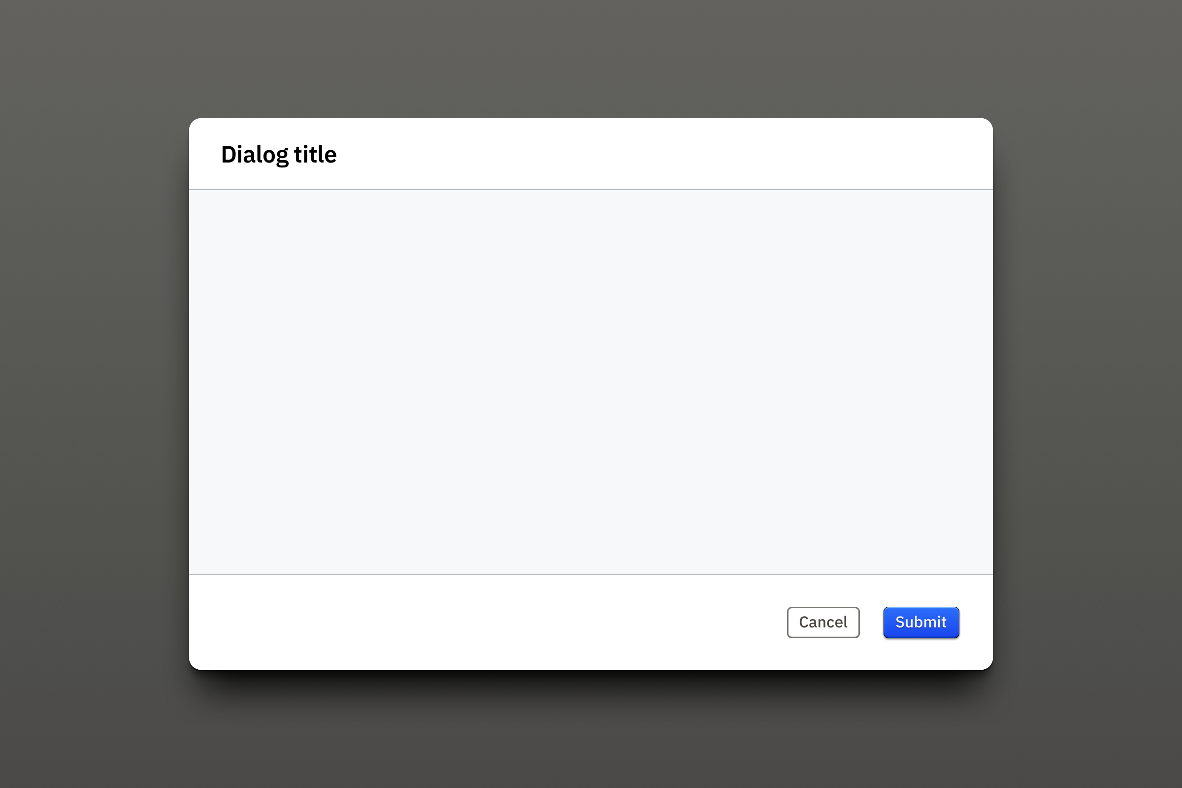
Dialog
Intent
Sometimes a workflow can branch in a situation where the user’s focus needs to be captured as much as possible, a task at hand requires as much screen estate as possible, and/or multiple interdependent decisions are required before applying them to the context.
Dialogs provide a temporary space coming with an interaction tonality shift, from which users exit after they made an explicit decision.
Anatomy
Dialogs are isolated from the context they were opened from with a semi-transparent overlay. This one has a gradient to reinforce the sense of depth in the application.
A horizontally centred container is where all content is laid out. Its strong drop shadow make it stand out even more from the overlay.
A title bar on top gives a succinct description of the goal to achieve in this dialog. For example: “Confirm project deletion”, “Re-order category items”, “Edit user profile”.
An action bar at the bottom is where buttons related to the task completion are found.
The content area is separated from the top and bottom bar using an ambient background and a single pixel inset drop shadow.
Interactivity
As mentioned above, a dialog should only be exited with a clear intent, using one of the buttons in the bottom action bar.
Application feedback
When applying modifications specified in the dialog to the context is was opened from, data transfer and computation can be nearly instantaneous. In this situation, closing the dialog should happen as soon as the user clicks the action button. When the application knows in advance that computation will be long, or that network conditions delay data transfer significantly, it should inform the user that a process is underway. A threshold of one second seems reasonable considering today’s expectations. There are two situations to consider:
- when the result of the dialog action does not alter the context, this process can happen in the background, and the user can be informed of its existence and completion by a global message component.
- when the result affects what’s in the user’s context, the dialog should not be closed before the app is ready to display the updated data. The existence of the ongoing process should be presented to the user at the same place the last action occurred – replacing the “submit” button for example. At process completion, the dialog can then be closed.
Layout
There can’t be more than one dialog window displayed at a time.
Never use scrolling inside a dialog. Instead, extend its height and leave a margin at the bottom equivalent to the top one.
Boards
Intent
When evaluating and planning evolutions for a railroad network, engineers need to compare and edit a lot of data points. They use as much screen real estate as possible, and very often have multiple screens workstations. Two monitors plugged to a laptop is a very common setup. This means OSRD has to be able to exist in multiple browser windows, as well as in a single one. The user needs an easy way to manage how the app content is displayed in one or multiple windows.
Additionally, studying a circulation hypothesis is a multistage process. OSRD provides tools and visualisations for each of them, but users don’t need all of them all the time. Being able to quickly show and display these tools helps them optimising their available screen real estate.
In summary, the need is to provide a way to show and hide parts of the app, as well as a solution to beam them to secondary windows, and back.
Anatomy
The solution was to:
- display content in containers named “boards”. A board contains a single type of content, or “family”;
- make it possible to send a board in a secondary browser window, existing or new, as well as to bring a board back to the main browser window;
- provide easily reachable toggle switches for each content family.
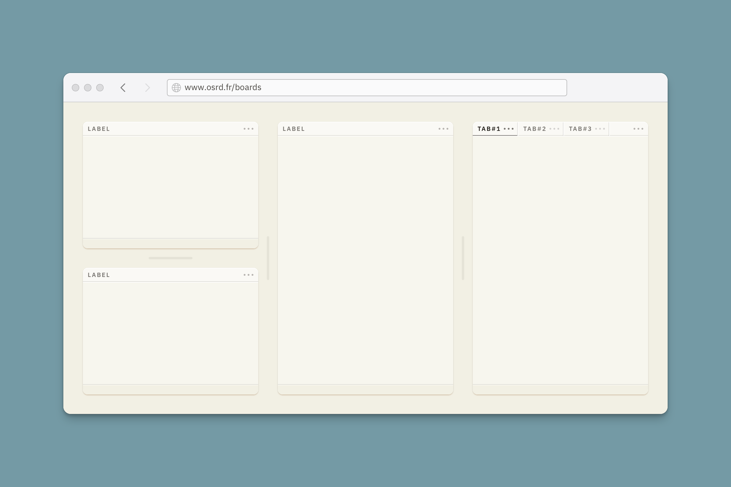
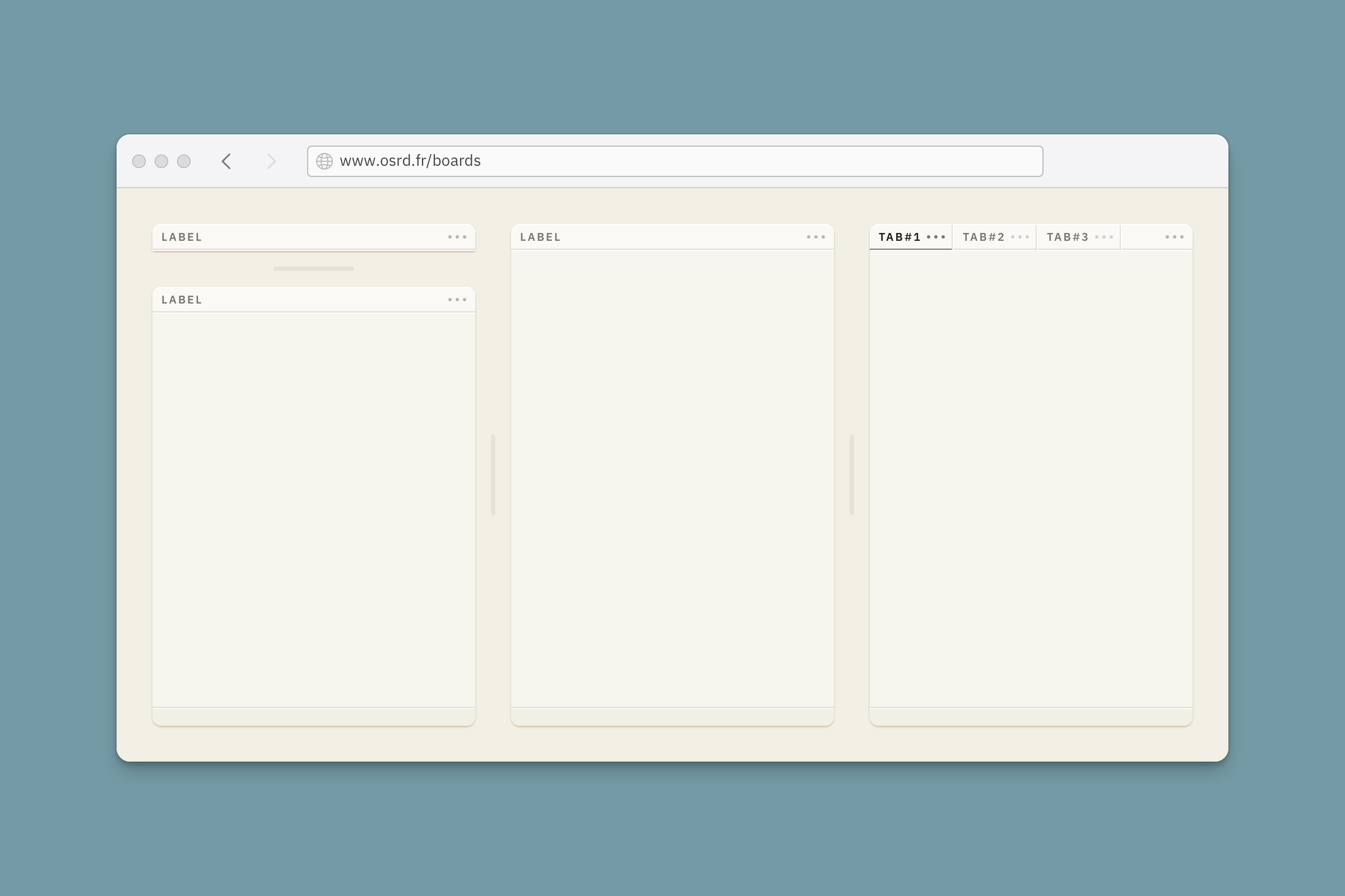
Boards sit at the first elevation level. Each one has a header, a content space and an optional footer. The footer should always be used when a board contains an item list with no margins.
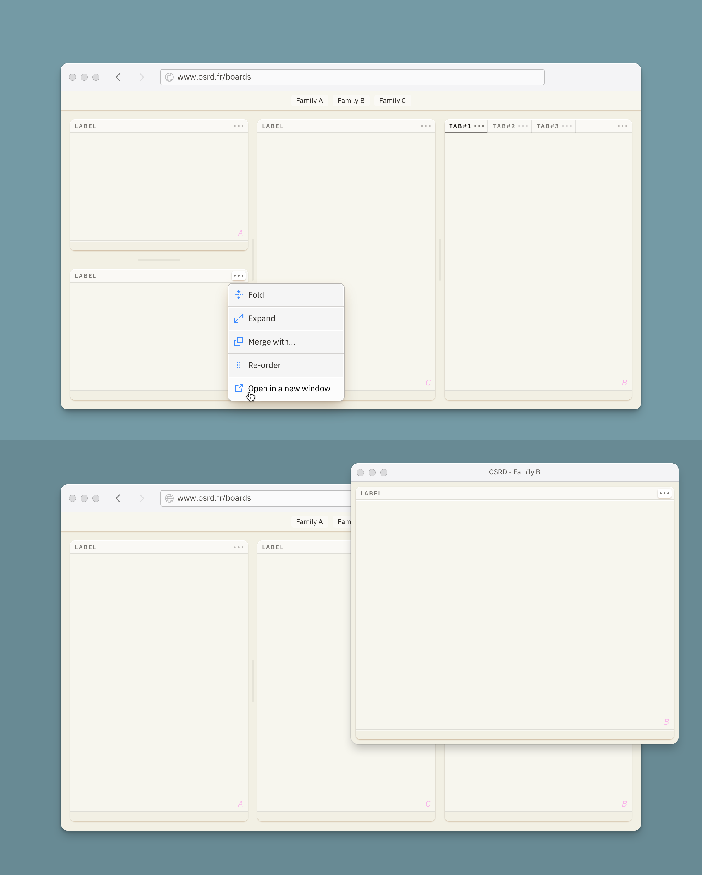
The header shows the board title and a button to access the board actions menu, which can list actions for the content in some cases.
A board can also group multiple tabs that can be managed from the header. In this case, each tab displays a title and a button to access a dedicated actions menu.
When boards are adjacent and at least one of them can have its dimensions adjusted, resizing handles are displayed between them.
When toggle switches are present, they need to be always visible. For now, a sticky container placed on top provides this functionality.
Interactivity
Board and tab titles react to cursor hover and mouse clicks. Tabs are either focused – with their associated content displayed in the board – or unfocused.
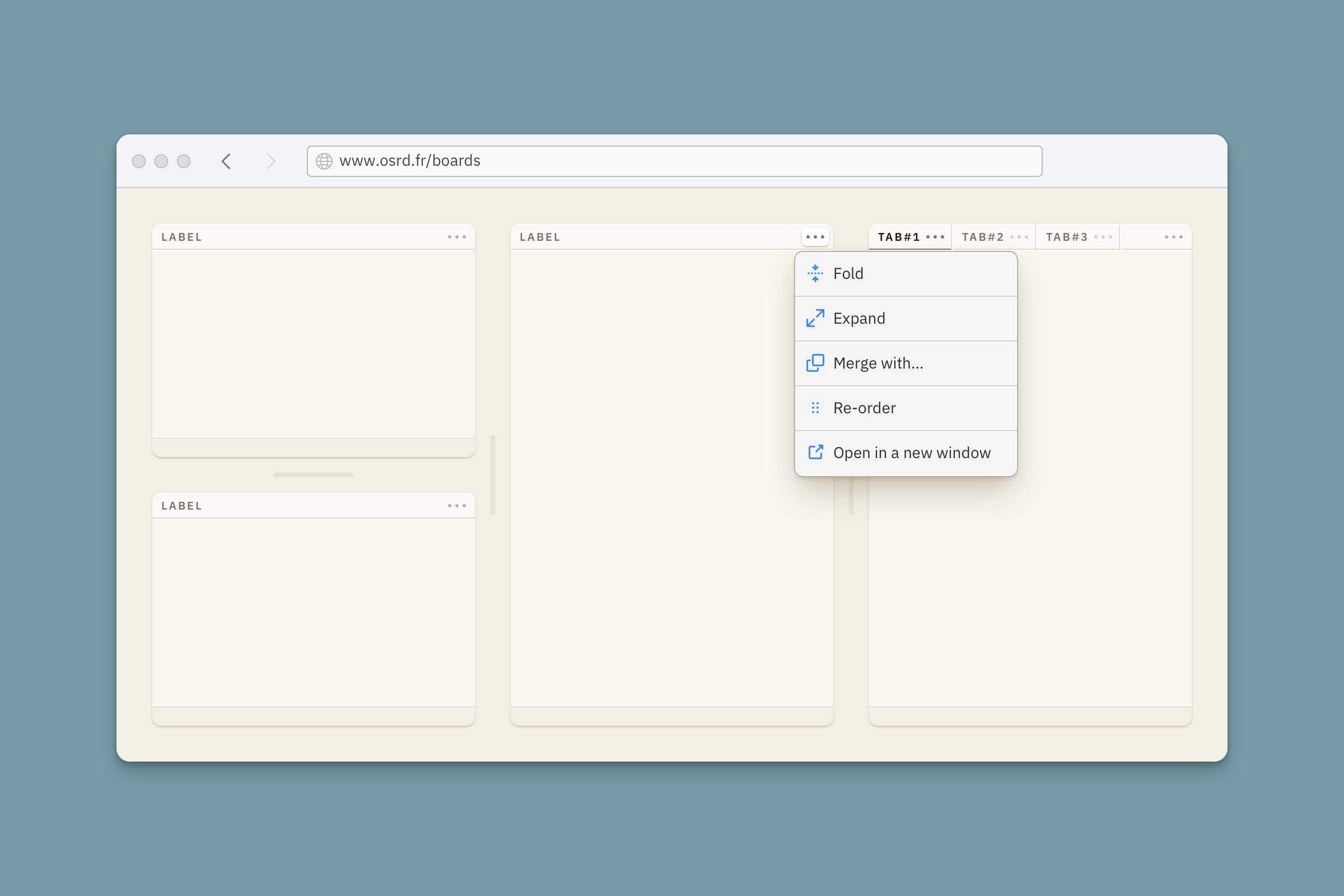
The actions menu button reacts to cursor hover, and displays the menu when it is clicked. Clicking it again, or clicking outside the menu, closes the actions menu.
Resizing handles react to cursor hover, and get even more visual presence on mouse down, while they are dragged.
User expression
Boards can be folded to a compact state by a single click on their title, or from the board actions menu. Their content and footer are hidden. This is an intermediate solution to make room for other boards without hiding entire content families with the toggle switch. They can be unfolded with a single click on their title, or by using the board actions menu.
Boards can be expanded to occupy the whole viewport with a single click on the header while pressing down the shift key, or by using the board actions menu. Expanded boards allow for a more confortable presentation of intricate data to users when they need more focus. Collapsing them to their previous folding state is done with a single click on their header, or from a button displayed at the bottom center of the viewport.
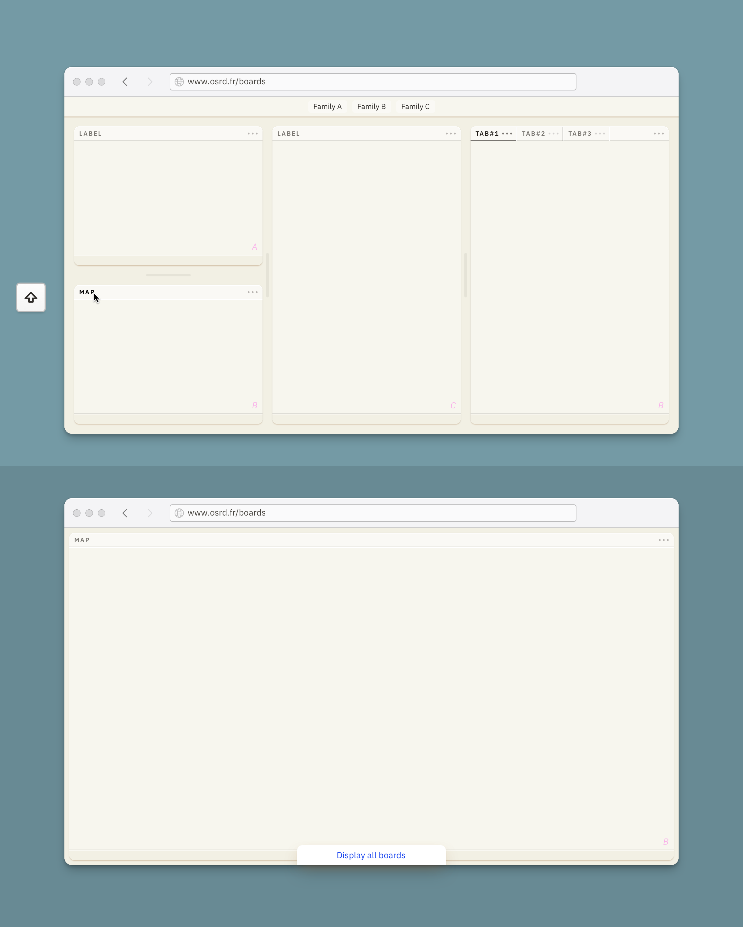
Boards can be sent to a new or existing secondary OSRD browser window from the actions menu.
Tabs can be folded just like regular boards by a single click on their title, if it is focused. A single click on an unfocused tab title will put it in focus. A tab can be removed from a tab group using the tab actions menu. They can be undocked from the board to a new adjacent board using the tab actions menu. They also can be moved from their board to another one, if these boards present the same content family.
Layout
Boards can have fixed dimensions, responsive dimensions, and/or user adjusted dimensions (using the resizing handles).
Boards can sit side by side and on top of each other, leaving some margin around them. These margins are responsive to the viewport’s dimensions.
Boards can be set to fill the viewport’s width. They also can have a fixed width, a minimum width, and a maximum width.
Boards can be set to fill the viewport’s height. In this case, when the content is taller, they contain a scrollview. They also can adjust their height to the content they display.
When board families are hidden using toggle switches, the other boards auto resize to fill the newly available space.
View boards artboardMessage banners
Displayed at the very top of the viewport, above any other content, banners are used to convey concise messages about the service itself: what the user should know about OSRD at this particular moment to be as efficient as possible. New features availability, upcoming maintenance, or connectivity issues are good examples.
They should not be used to display user interactions feedback, such as form validation. They are not sticky on scroll and can or cannot be dismissed.
Banners are a straightforward use of the colours, icons, and text styles previously described here.
the app will be in this area
the app will be in this area
the app will be in this area
the app will be in this area
Layout
Their height can remain minimal as their background colour will make them stand out visually and hard to miss.
They’re composed of a backdrop solid color, an icon, a short title, an optional short text which might contain a link, an optional dismiss button, and a horizontal rule to isolate them from the app. All these elements are themed to reflect the nature of the message: information, success, warning or error. The icons can be generic to this nature, or more specific to the message when possible.
Icons
Positive message get outline icons, and negative message get filled icons, for more visual impact
Bottom border
It’s built with two strokes, which will (supposedly) not be used anywhere else in the app. A white stroke at the bottom creates a discreet stamped visual effect, participating in adding depth to OSRD’s interface.
Link
They keep the primary colour to stand out more. Banners are for important messages, but their compact format doesn’t allow for much details. If more details need to be communicated to users, having striking links in the message will make it more likely for them to visit them. The alternative would have been to use the text colour of the message with an underline, but it doesn’t make links stand out enough.
❧